Case Study · 2023
Client
Window Plus Swiss
Year
2023
Services
Logo Design
Industry
Joinery & Windows
Location
Switzerland
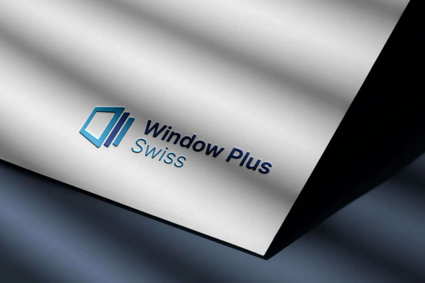
Window Plus Swiss is a Swiss company specializing in joinery and windows. For them, we created a logo that turns the company's name into a clear, memorable image.
Deliverables
01, Challenge
The Swiss joinery and window market is known for high standards of quality and precision craftsmanship. The logo had to communicate that immediately, while staying simple, legible and easy to recognize.
The name itself brought a clear idea to work with: the word "Plus" speaks to something added, to more than what's expected.
02, Approach
We built the symbol directly on the word "Plus." A window frame shown in perspective is followed by two narrower panels lining up one after another, like windows being added in a row. One glance is enough to understand both what the company does and what its name means.
The palette sits in shades of blue, a color naturally tied to glass, light and the sky seen through a window, but also to reliability and precision. The symbol moves from a lighter to a darker blue, giving it depth, and the same relationship repeats in the typography: "Window Plus" is set in a darker blue, sturdier typeface, while "Swiss" is set in a lighter blue, thinner weight, so the company's origin is present but unobtrusive.
03, Result
Window Plus Swiss ended up with a logo that's simple, precise and easy to remember, with a clear link between the name, the business and the visual mark, and one that meets the high expectations of the Swiss market.
Next Case Study
We use essential cookies to keep the site working, plus a few third-party services - Google Fonts, and reCAPTCHA on the contact form - that may set their own cookies. Privacy Policy.
