Case Study · 2023 – 2026
Type
Client Projects
Years
2023 – 2026
Services
Logo Design
A logo is the shortest form of communication a brand has. In a single mark, it needs to carry a company's values, character and promise, at any size, on any surface, in any colour.
Deliverables
The Logos
A clear, medical mark for a diagnostics lab, with a cross set in a square and a teal-navy palette that reads as reliable and calm rather than sterile.

A logo for the new name of a company with more than 20 years of experience in industrial automation, carrying forward the trust built under the name Metronik inženjering.

A monogram that merges the letters D and J into a single mark. To a foreigner it reads as "Dj," while the empty space where the stroke would sit completes the letter Đ for a Serbian eye.
A logo for Unicorn Energy, a German renewable energy company. The green palette and geometric form come directly from the industry itself.
A precise, technical mark for an IT company, systematic rather than decorative.
A mark built as the tip of a pyramid, inspired by the tip of a projectile, for a global procurement and logistics partner in the defense industry.

A friendly, approachable mark for an IT studio that builds online stores and websites.

A playful mark for a Swiss second-hand furniture concept, approachable rather than corporate.

A window frame followed by panels lining up one after another, a visual expression of the word "Plus," for a Swiss joinery and window company.
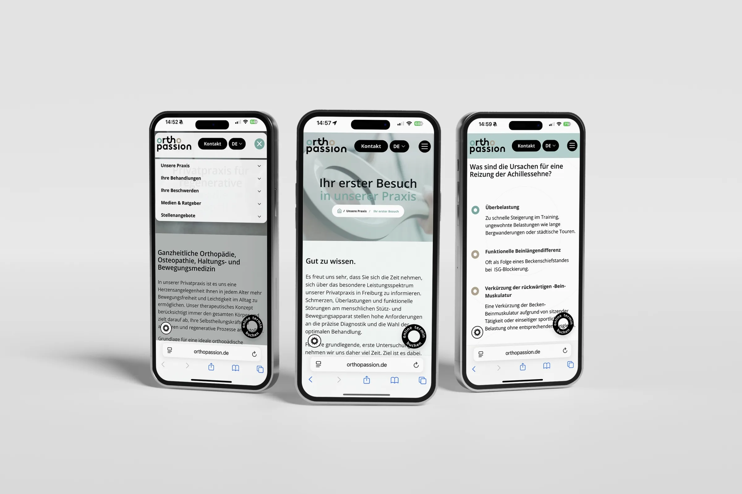
A logo for a cooperative from Freiburg that advises medical institutions and practices, grown out of the experience of the private orthopedic practice Orthopassion.

A logo for Kerbholz's sister company from the world of wood, with a geometric mark and clean, stable typography.

The letter K shaped as a notch in wood ("Kerbe" means notch, "Holz" means wood), for a Swiss parquet flooring company.
A confident logo for a concept fashion store in Montenegro.
A clean, functional mark for a company that equips supermarkets, hospitality venues and warehouses.

A logo with a Swiss cross set in a red square and clear typography, communicating origin and precision at a glance.

A burgundy logo, with the letter "i" set apart as its own block and clear, stable lettering.
01, Challenge
This collection shows a selection of logos we've created for clients in Serbia, Switzerland, Germany, Bosnia and Herzegovina and Montenegro, across fields like healthcare, industrial automation, energy, IT, retail, joinery and consulting. Each logo has its own story, but the same task: to compress, into a single mark, who the company is and what sets it apart.
02, Approach
We approach every logo the same way: we get to know the industry and the competition, look for what sets the client apart, and find the form that expresses it without leaning on trends or clichés. The idea often comes from the name itself: the letter Đ at Srđan Hair, a notch in wood at Kerbholz, windows lining up at Window Plus Swiss. A good logo has to still work in ten years, and that constraint is what forces clarity.
03, Result
The collection spans wordmarks, monograms, symbols and combination marks, chosen for each client's context rather than aesthetic preference. What they share is this: each one says exactly what it needs to, and nothing more.
Next Case Study
We use essential cookies to keep the site working, plus a few third-party services - Google Fonts, and reCAPTCHA on the contact form - that may set their own cookies. Privacy Policy.
